Spotify’s New Logo Has Split the Internet in Half: Brilliant Rebrand or Design Disaster?
The internet is officially divided over the new Spotify logo update. Some users are calling it bold, nostalgic, and refreshing. Others are describing it as ugly, confusing, and one of the worst logo redesigns in recent memory.
What was meant to be a celebratory visual refresh for Spotify’s 20th anniversary has quickly evolved into a full-scale online debate. Social media platforms like Reddit and X exploded with reactions within hours of the update rolling out, proving once again that changing a recognizable logo is one of the riskiest moves a brand can make.
But why are people reacting so strongly to what is technically just an app icon?
The answer goes deeper than design alone.
What Changed With the Spotify Logo?
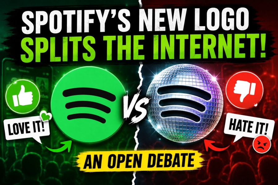
Spotify replaced its iconic flat green logo with a shiny, disco-ball-inspired version to celebrate the platform’s 20th anniversary. The temporary redesign keeps the recognizable circular shape and signature soundwave lines but adds reflective textures, shadows, and a 3D aesthetic.
The update is tied to Spotify’s “Spotify 20: Your Party of the Year(s)” campaign, which highlights users’ listening history over the past two decades. The disco-ball look is meant to symbolize celebration, nightlife, music culture, and nostalgia.
For some fans, the redesign feels playful and energetic.
For others, it feels like visual chaos.
And that split reaction is exactly why the logo debate has become one of the hottest design conversations online this week.
Why Some People Love the New Spotify Logo
Not everyone hates the redesign. In fact, a surprisingly large group of users actually appreciates the direction Spotify took.
Supporters argue that modern app design has become too sterile, flat, and predictable. They see Spotify’s disco-ball logo as a rare example of a major tech company embracing personality again.
Many users described the new icon as “fun,” “retro,” and “refreshingly different.” On Reddit, several comments praised the company for breaking away from the endless wave of minimalist branding dominating the tech industry.
One Reddit user wrote that the redesign “gives off those early-2000s vibes when companies actually experimented and tried to stand out.”
Another user defended the logo by saying:
“It’s fun. It’s also temporary.”
That opinion reflects a growing frustration with modern corporate branding. Over the last decade, countless companies simplified their logos into flat, geometric, monochrome designs. Critics often call this trend “corporate minimalism.”
Spotify’s redesign almost feels like a rebellion against that movement.
Instead of looking perfectly polished and algorithmically optimized, the disco-ball icon intentionally looks flashy, loud, and nostalgic. For some users, that imperfection is exactly what makes it memorable.
Why Other Users Absolutely Hate It
While supporters see creativity, critics see confusion.
A lot of confusion.
One of the biggest complaints is that the logo doesn’t instantly look like Spotify anymore. Users reported mistaking the icon for a loading symbol, download indicator, or even a glitch on their phone screens.
Others described the design as “pixelated,” “cheap,” or “AI-generated.”
One viral Reddit comment joked:
“It looks like someone just put 3 lines on a disco ball.”
That criticism highlights a major issue in logo design: recognizability.
Spotify’s original logo became iconic because it was instantly identifiable at any size. Whether on a phone screen, billboard, smartwatch, or desktop browser, users could recognize it immediately.
The new version sacrifices some of that simplicity for visual style.
And for many users, that tradeoff was not worth it.
The Psychology Behind Why Logo Changes Trigger People
Logo redesigns almost always create backlash.
Why?
Because people build emotional familiarity with visual identities over time, brands like Spotify become part of daily routines. Users open the app dozens of times per day. The logo becomes psychologically linked to comfort, habit, and recognition.
When that familiar symbol suddenly changes, even slightly, it can create a strange sense of disruption.
This is not unique to Spotify.
Over the years, companies like Instagram, Twitter, Uber, and Airbnb all faced heavy criticism after redesigning their logos.
In many cases, users eventually accepted the changes.
Some even grew to love them later.
The human brain naturally resists visual change, especially when tied to familiar products.
That emotional attachment explains why something as small as an app icon can dominate social media discussions worldwide.
Is Spotify Intentionally Creating Controversy?
There’s another interesting theory floating around online:
What if Spotify wanted this reaction?
From a marketing perspective, controversy creates attention. Attention creates engagement. Engagement creates conversation. And conversation keeps brands culturally relevant.
Spotify knows its audience lives online. The company understands internet culture extremely well, especially younger audiences who thrive on memes, debates, and viral reactions.
A safe redesign would have been ignored within hours.
This redesign was impossible to ignore.
Whether users loved it or hated it, they talked about it.
And in modern digital marketing, attention is often more valuable than approval.
The Rise of Anti-Minimalist Branding
The Spotify logo debate also reflects a much bigger trend happening across the design industry.
For years, tech companies embraced ultra-clean minimalism. Logos became flatter, softer, simpler, and more corporate.
But recently, many creatives have started pushing back.
People are becoming tired of brands looking identical.
This new wave of “anti-minimalist” design embraces bold textures, gradients, nostalgia, Y2K aesthetics, chrome effects, and experimental visuals. Spotify’s disco-ball logo fits perfectly into that movement.
The internet is currently obsessed with early-2000s culture. Fashion, music videos, website aesthetics, and graphic design trends from that era are all returning.
Spotify’s redesign feels heavily influenced by that nostalgia cycle.
For younger audiences, the logo looks trendy and playful.
For others, it looks outdated and messy.
That generational split is a huge reason the debate feels so intense.
Temporary Logo or Permanent Change?
Thankfully for users who dislike the redesign, Spotify has indicated that the disco-ball icon is temporary and tied specifically to its anniversary celebration.
That detail has calmed some criticism online.
Many users who initially panicked after seeing the update later realized it was more of a celebratory campaign than a permanent rebrand.
Still, the backlash reveals how deeply users care about visual identity.
Even temporary changes can spark massive emotional reactions.
What This Means for Branding in 2026
The Spotify debate teaches an important lesson about modern branding:
People no longer passively consume design updates.
They actively participate in them.
Social media transformed branding into a public conversation. Every redesign now becomes instant internet discourse. Users create memes, reaction videos, Reddit threads, TikToks, and debates within minutes of launch.
Brands are no longer designing in silence.
They are designing in front of millions of critics.
At the same time, companies are learning that emotional reactions — even negative ones — can still strengthen visibility.
The worst possible outcome for a redesign today is not backlash.
It’s irrelevance.
And Spotify definitely avoided irrelevance.
The Internet’s Final Verdict? Completely Divided
Right now, there is no clear consensus on Spotify’s new logo.
Some users genuinely love the boldness and creativity.
Others cannot wait for the original icon to return.
That division is what makes this story so fascinating.
The redesign became bigger than just a logo update. It evolved into a debate about modern branding, nostalgia, corporate minimalism, internet culture, and even the future direction of app design itself.
In a strange way, the split reaction may actually prove the redesign succeeded.
Because people care.
And in today’s digital world, getting millions of people emotionally invested in a logo is incredibly difficult.
Whether the disco-ball Spotify logo goes down as brilliant marketing or a design misfire, one thing is undeniable:
The internet is talking about it nonstop.
And Spotify probably knew exactly what it was doing.
